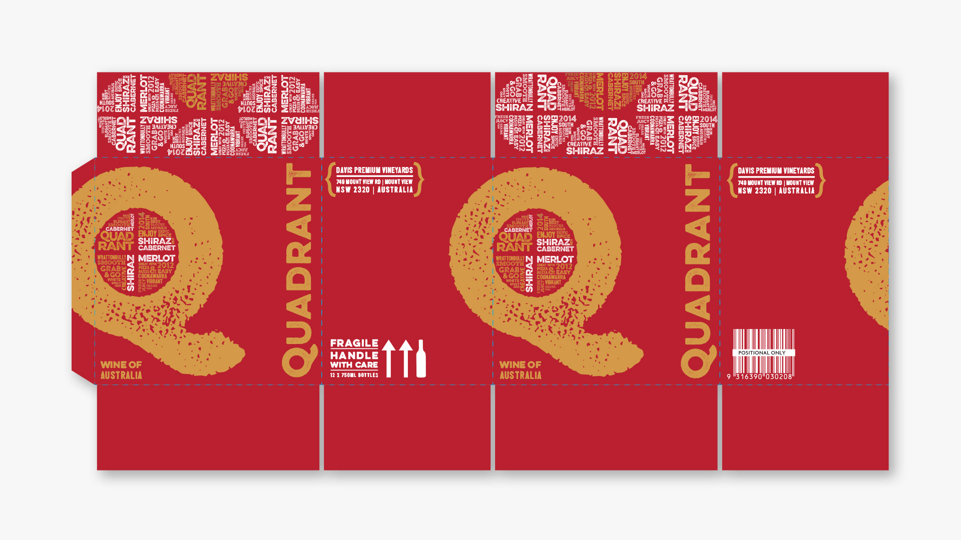
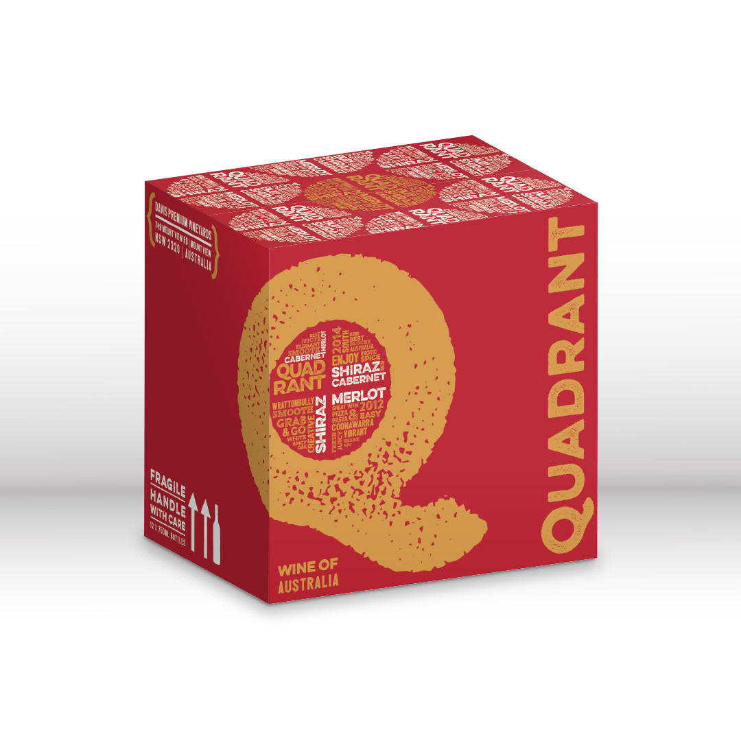
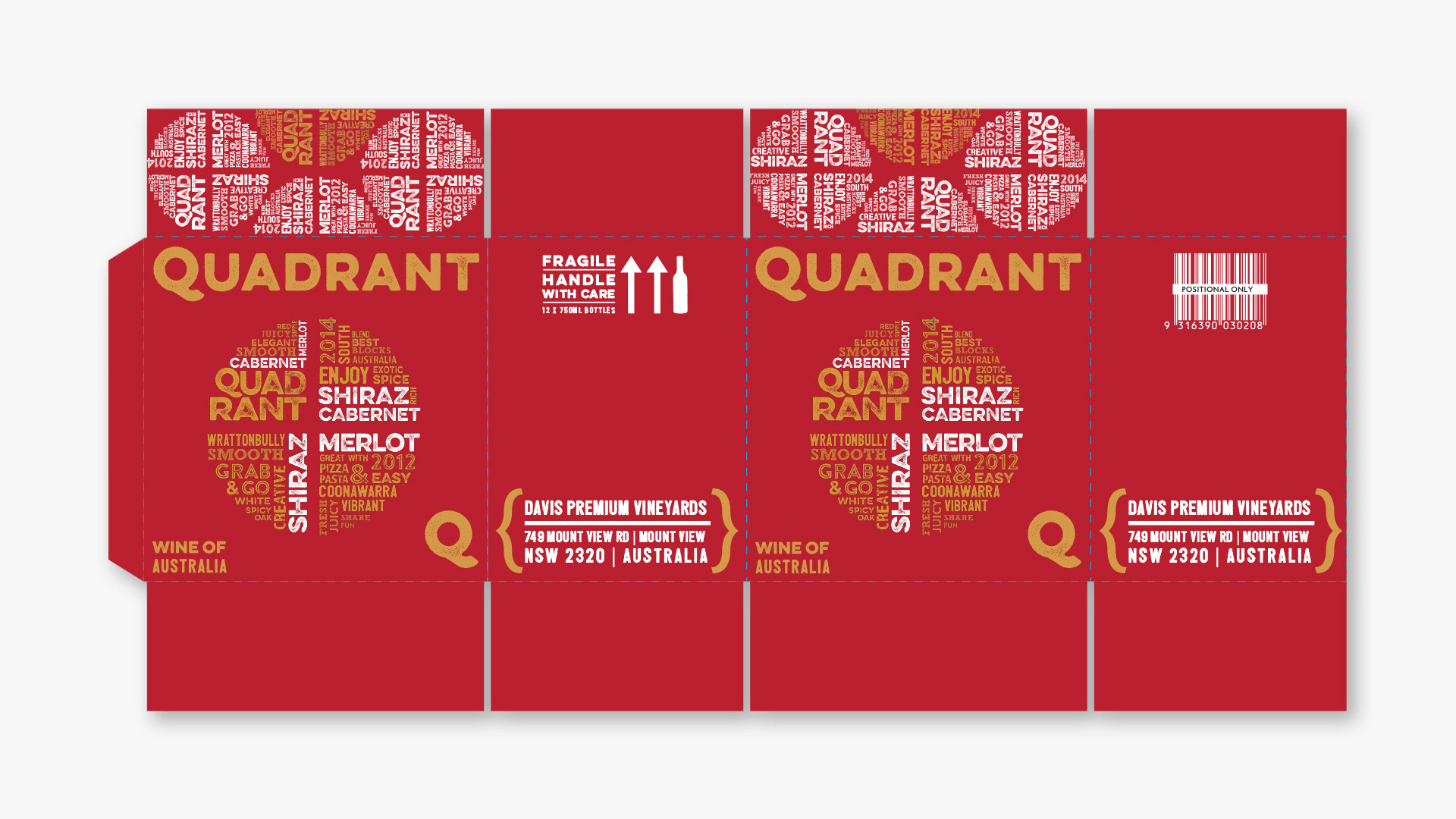
Case packaging mock-up
Conservative version
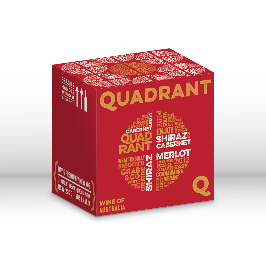
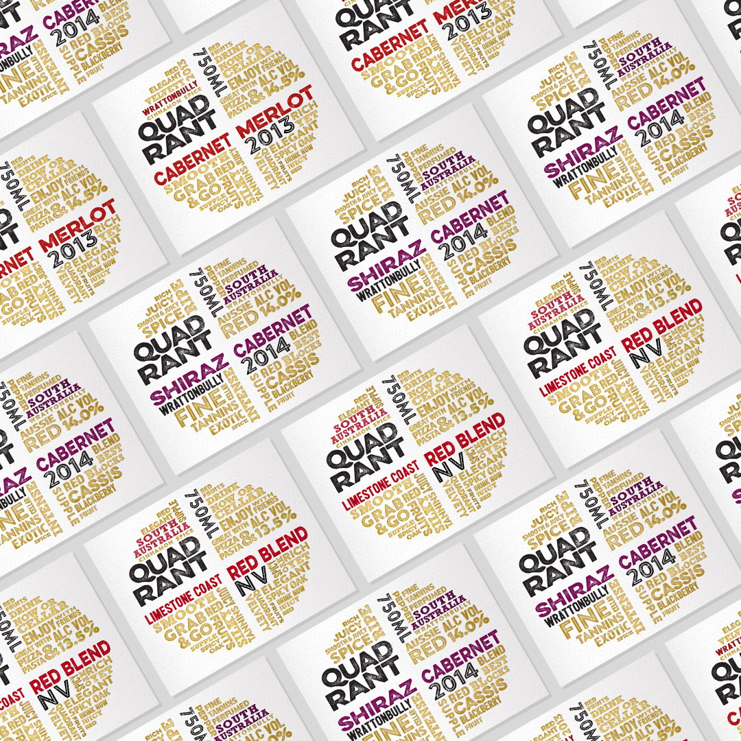

Looking to expand into the Chinese market, I was commissioned to create a number of conceptual packaging options for Quadrant Wines for Chinese export, utilising the colours of gold and red, and tying in with the existing bold, modern labels (designed by others). The wines are described as “fun and vibrant”, and it was likewise a very enjoyable project mocking-up these playful, striking boxes! The client also requested a series of revised labels, to tie in with the Chinese colour palette.